

Wall Art By Color
The colour of your wall art affects the room before anyone looks closely at the subject. Blue calms. Orange energises. Black and white grounds without competing. Green brings the outside in. Gold adds warmth and perceived luxury without requiring a renovation.
Use this guide to find the right colour for your space, your existing palette and the mood you want the room to create. Each section covers colour psychology, combinations that work and specific room guidance — followed by recommended pieces from the Bruzzen collection.
For the science behind why colour affects mood so consistently, read the full guide: The Psychology Behind Color Choices in Wall Art →
Blue Wall Art
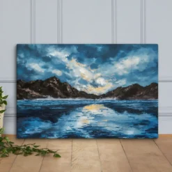
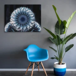
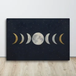
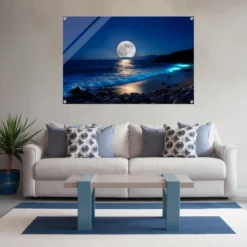
Blue is the most universally liked colour in interior design — and the most reliably effective for spaces where calm and focus are the goal. It lowers perceived heart rate and reduces cortisol levels, which is why it outperforms almost every other colour in bedroom and bathroom wall art across every demographic study on interior colour preference.
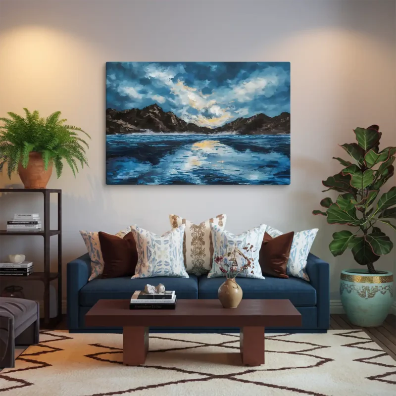
Choose blue for: bedrooms, bathrooms, home offices, meditation spaces, any room where slowing down is the point.
Avoid blue in: north-facing rooms without warm artificial lighting — it reads as cold without natural light to balance it. Pair with warm timber, cream textiles or brass fixtures to prevent a cold interior.
Blue variations
| Shade | Best use |
| Navy blue | Formal spaces, executive offices, dining rooms |
| Deep blue | Feature walls, statement pieces, dramatic interiors |
| Light blue | Bedrooms, bathrooms, nurseries, coastal themes |
| Turquoise | Energy in modern and tropical-inspired spaces |
| Royal blue | Bold statement pieces, living room focal points |
| Sky blue | Airy and open — hallways, small spaces, ceilings |
Blue colour combinations
- Blue and Grey — modern and neutral, works in any room
- Blue and Gold — adds luxury, suits formal spaces
- Blue and Green — natural and serene, coastal and botanical
- Blue and White — crisp and classic, Hamptons and Scandi styles
- Pink and Blue — playful and balanced, nurseries and dorm rooms
Blue wall art by room
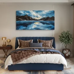
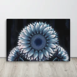
Bedroom: The strongest colour choice for sleep quality. A large abstract blue canvas at 24×30 or 30×40 above the headboard creates a calming visual anchor without demanding attention during rest. Muted teal and navy tones work better than bright blue in bedroom environments.
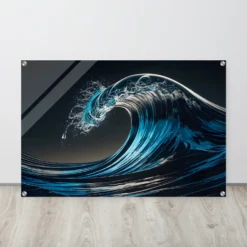
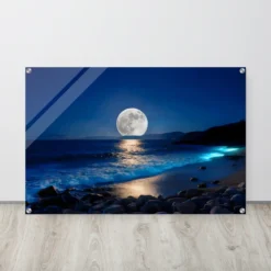
Bathroom: Creates a spa-like atmosphere. Acrylic blue prints handle bathroom humidity better than canvas or paper. Coastal and ocean blue designs in 12×16 to 18×24 work well in most bathroom wall spaces.
Home office: Blue supports focus and productivity better than any other colour in documented workplace studies. A navy or deep blue abstract print behind a desk reads as professional and considered on video calls.
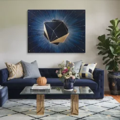
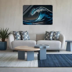
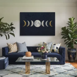
Living room: Large blue canvas art makes a confident feature wall statement. Blue is one of the safest choices for a living room feature wall because it pairs easily with the neutral sofas, timber floors and cream walls that most living rooms already have.
→ Shop Blue Wall Art → Blue Wall Art Ideas: A Comprehensive Guide → Living Room Wall Art
Orange Wall Art
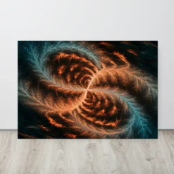
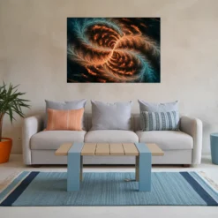
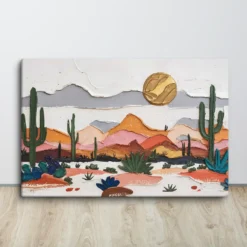
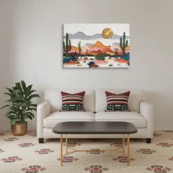
Orange is the most energising colour on the spectrum — warm, confident and impossible to ignore. It stimulates appetite, raises energy levels and creates an atmosphere of sociability. This makes it the right choice for kitchens, dining rooms and social living spaces — and the wrong choice for bedrooms or workspaces where focus and calm are needed.
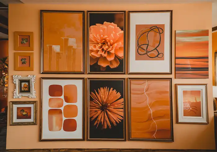
Choose orange for: kitchens, dining rooms, social areas, creative workspaces, gyms, accent walls in neutral rooms.
Avoid orange in: bedrooms, therapy offices, meditation spaces or any room where calm is the primary goal.
Orange variations
| Shade | Best use |
| Burnt orange | Cosy interiors, rustic and earthy palettes, autumn themes |
| Terracotta | Mediterranean and bohemian spaces, warm neutrals |
| Vibrant orange | Feature walls, gyms, energetic statement pieces |
| Peach | Soft and approachable — works in bedrooms unlike saturated orange |
Orange colour combinations
- Orange and Blue — high-contrast and energetic, visually striking
- Orange and Grey — sophisticated and balanced, works in modern spaces
- Orange and Brown — warm and earthy, rustic and organic aesthetics
- Orange and Gold — luxurious and warm, maximalist interiors
- Orange and White — clean contrast, contemporary and bright
Orange wall art by room
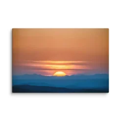
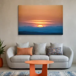
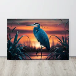
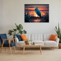
Kitchen: Orange is the most evidence-supported appetite stimulant in interior colour research. A single framed orange abstract or sunset canvas in a kitchen or dining area at 16×20 to 20×24 inches adds warmth without overwhelming the functional elements of the space.
Living room: A burnt orange or terracotta statement piece brings warmth to neutral living rooms — particularly effective against grey or white walls where the contrast is clean and high-impact. Keep surrounding pieces neutral to avoid visual competition.
Gym or creative workspace: Vibrant orange is the strongest energising colour choice for spaces built around physical activity or creative output.
→ Stunning Orange Wall Art Ideas for Your Home Decor
Green Wall Art
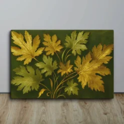
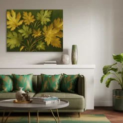
Green is the colour the human eye processes with the least effort, which is why it dominates in spaces designed for rest and recovery. It connects the interior to the natural world, reduces visual fatigue and creates an atmosphere of balance and renewal. It is the most versatile colour in the natural palette because almost every shade works in almost every room.
Choose green for: any room — particularly bedrooms, bathrooms, living rooms and therapeutic spaces where a connection to nature improves the experience of the room.
Green variations
| Shade | Best use |
| Sage green | Bedrooms, bathrooms, wellness spaces — soft and calming |
| Dark green | Feature walls, dramatic dining rooms, executive offices |
| Emerald green | Bold statement pieces, glamorous and sophisticated spaces |
| Olive green | Warm and earthy, works with timber and natural materials |
| Mint | Fresh and light, suits kitchens, bathrooms and nurseries |
Green colour combinations
- Blue and Green — natural and serene, coastal and botanical
- Pink and Green — fresh and playful, suits light and romantic spaces
- Green and White — crisp and natural, botanical and Scandi styles
- Green and Brown — earthy and organic, works with natural materials
- Green and Grey — elegant and neutral, sophisticated modern interiors
- Green and Gold — warm and luxurious, maximalist botanical styling
Green wall art by room
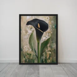
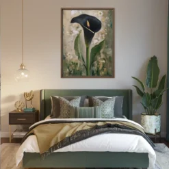
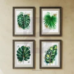
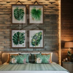
Bedroom: Sage and muted green tones perform as well as blue for sleep quality in most interior studies — particularly for people who find blue too cool. A botanical green canvas above a headboard in a room with warm timber or cream tones is one of the most consistently successful bedroom art combinations.
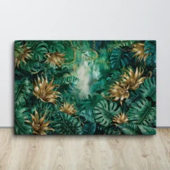
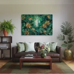
Bathroom: Fresh and rejuvenating. Green botanical prints in a bathroom feel spa-like without requiring a full renovation. Acrylic prints handle bathroom humidity better than canvas and are available in green botanical subjects across multiple sizes.
Living room: Deep emerald or forest green makes a bold feature wall statement. In large format — 30×40 or 36×48 — a green abstract or botanical canvas reads as sophisticated rather than overwhelming when placed against a neutral wall.
Red Wall Art
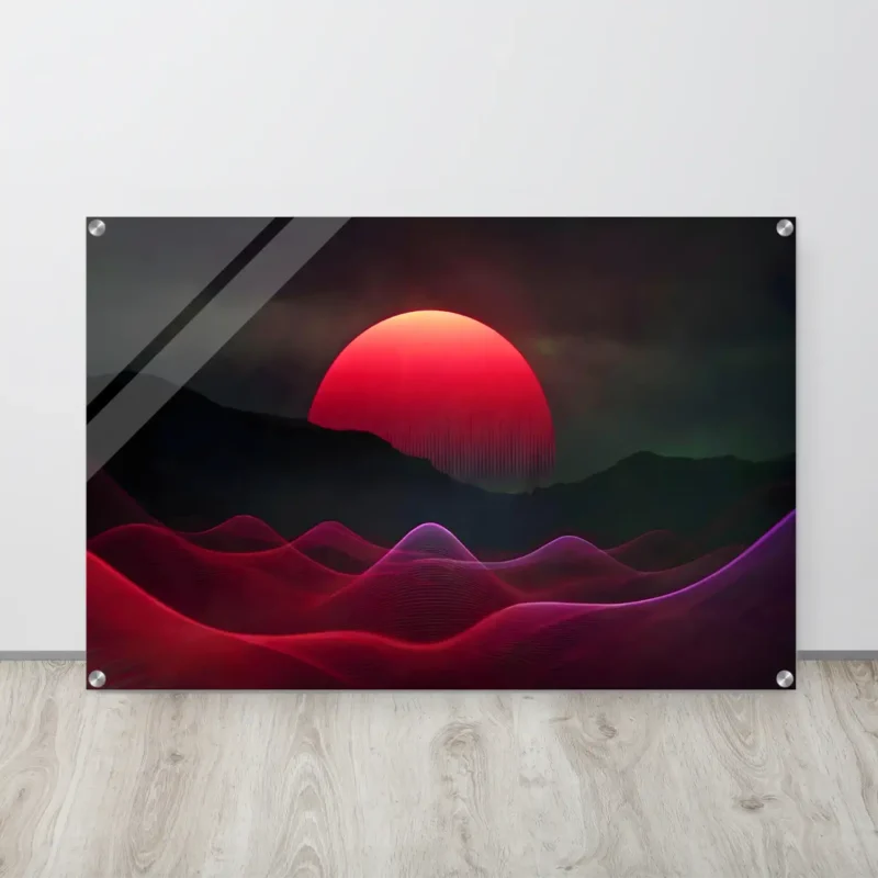
Red is the highest-energy colour in the visible spectrum. It raises heart rate, increases alertness and creates an atmosphere of drama and passion. Used well it is one of the most powerful statement colours in interior design. Used carelessly it is overwhelming.
The key with red wall art is restraint. One red piece as a deliberate focal point works. Red on every wall creates visual fatigue. The colour itself provides enough energy — the space around it should be neutral.
Choose red for: living rooms (feature wall only), dining rooms, kitchens, bar areas, entrance halls.
Avoid red in: bedrooms, nurseries, offices, meditation spaces, healthcare waiting rooms.
Red colour combinations
- Red and Black — edgy and sophisticated, bold and dramatic
- Red and White — classic and clean, Scandi and modern styles
- Red and Gold — elegant and regal, luxurious interiors
- Red and Grey — balanced and modern, one red piece in a neutral room
- Red and Blue — striking contrast, bold and confident
Red wall art by room
Dining room: Red stimulates appetite and conversation — both exactly what a dining room needs. One large red abstract or botanical canvas on the wall opposite the main seating position creates a focal point that makes meals more memorable. See large wall art ideas →
Living room: One red statement piece — 24×36 or larger — on a feature wall brings drama without requiring commitment to a red colour scheme. Pair with black frames, dark timber or charcoal textiles to prevent the red from reading as overpowering.
Kitchen: Red energises the cooking space and reinforces appetite. A single red canvas at 16×20 to 20×24 works well in most kitchen wall spaces between cabinetry.
→ Shop Red Wall Art → Wall Decor Ideas for Living Room: Modern, Elegant & Cheap → Dining Wall Art
Pink Wall Art
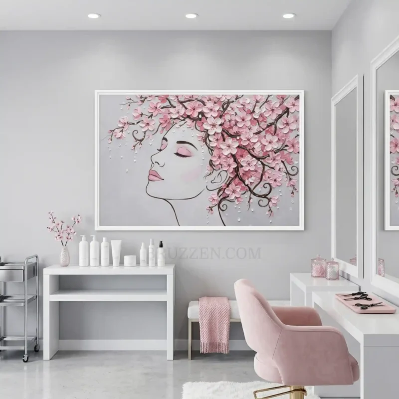
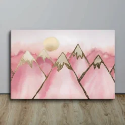
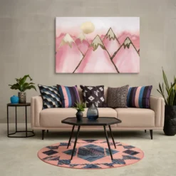
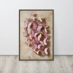
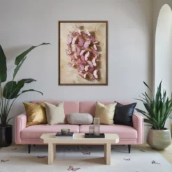
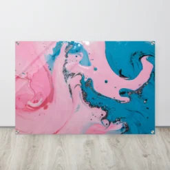
Pink spans more emotional territory than any other colour. Soft blush and dusty rose create warmth and femininity. Hot pink and magenta bring energy and confidence. The shade determines everything about which room and which aesthetic it suits.
Environmental psychology research shows that soft pink tones reduce aggression and promote calm — which is why many high-end wellness and beauty spaces use blush as their signature colour.
Soft pink best for: bedrooms, nurseries, beauty studios, wellness spaces, bathrooms.
Bold pink best for: feature walls, creative offices, dorm rooms, social spaces, accent pieces.
Pink variations
| Shade | Best use |
| Blush | Warm and sophisticated, luxury beauty and wellness spaces |
| Dusty rose | Soft and vintage, bohemian and romantic rooms |
| Hot pink | Bold and modern, feature walls and creative spaces |
| Light pink | Gentle and airy, nurseries, bathrooms |
| Coral | Warm and tropical, sits between pink and orange |
Pink colour combinations
- Pink and White — fresh and airy, clean and light interiors
- Pink and Blue — playful and balanced, nurseries and dorm rooms
- Pink and Gold — elegant and luxurious, beauty salon and bedroom
- Pink and Green — natural and lively, botanical and garden themes
- Pink and Grey — chic and sophisticated, modern and minimalist
Pink wall art by room
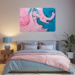
Bedroom: Blush and soft pink tones are among the most effective bedroom colours for creating warmth without stimulating energy. A large botanical or abstract canvas in dusty rose or blush above the headboard suits romantic and contemporary bedroom aesthetics equally well. See framed vs unframed options →
Nursery: Soft pink in a nursery creates a gentle, warm environment without being cliché. Combine with mint, white or sage for a more contemporary nursery palette.
Beauty and nail studios: Blush and gold is the dominant aesthetic in luxury nail and beauty studios. Pink wall art in these spaces doubles as décor and brand identity. Nail Salon Wall Art →
Dorm room: Hot pink and bold pink accents bring energy and personality to a small space without requiring permanent changes. See small space wall art ideas →
Purple Wall Art
Purple sits between the calm of blue and the passion of red — which makes it one of the most psychologically complex colours in interior design.
Deep purple and plum signal luxury, creativity and depth. Lavender and lilac carry softness and spiritual associations. Both work differently in the same room.
Deep purple best for: dramatic feature walls, executive offices, dining rooms, creative studios.
Soft purple/lavender best for: bedrooms, meditation spaces, bathrooms, spa environments.
Purple colour combinations
- Purple and Grey — elegant and neutral, suits formal rooms
- Purple and Green — natural and regal, botanical and artistic
- Purple and Blue — deep and harmonious, moody and sophisticated
- Purple and Gold — luxurious and warm, maximalist and opulent
- Pink and Purple — soft and romantic, suits bedrooms and bathrooms
- Purple and White — fresh and contemporary, modern minimalist
Purple wall art by room
Bedroom: Lavender specifically has documented sleep-promoting properties in colour psychology research. A soft lavender or muted purple abstract above the headboard creates a calming visual anchor without the coldness that some blues can bring in artificial lighting.
Bathroom: Purple adds a spa-like luxury to bathroom spaces. Pairing purple art with white tiles and chrome fixtures creates a polished, premium feel.
Creative studio or office: Deep purple signals creativity and artistic ambition in workspace environments. A large abstract purple canvas on a feature wall in a creative studio communicates the kind of thinking that happens in that space. See cool office wall decor ideas →
→ Shop Purple Wall Art → Canvas vs Paper Prints: Which Is Right for Your Wall? → Bathroom Wall Art
Black and White Wall Art
Black and white is the most versatile colour choice in wall art. It pairs with every interior colour scheme without competing, reads as sophisticated in formal spaces and as bold in modern ones, and retains its visual impact indefinitely — it does not date the way colour choices can.
For spaces where you are uncertain about committing to a colour, black and white is always the right holding position. It works while you decide — and often keeps working after you have decided.
Best for: any room, any style, any wall colour. Particularly effective in home offices, executive spaces, hallways, dining rooms and spaces with mixed colour schemes that need a unifying neutral element.
Black and white combinations
- Black and White alone — the most timeless and consistent combination
- Black, White and Gold — elevates to luxury without adding colour
- Black, White and Wood — warm and contemporary, Scandi-inspired
- Black, White and Colour accent — one colour piece with black and white supporting pieces creates a gallery wall with clear visual hierarchy
Black and white wall art by room
Home office and executive space: Black and white photography, architectural prints and abstract compositions in quality frames consistently perform as the strongest professional backdrop choice. They signal seriousness and taste without distraction. Professional office wall decor →
Hallway and entryway: A series of consistently framed black and white prints in a hallway reads as a considered gallery rather than random decoration. All black frames, consistent sizing, 2 to 3 inches between frames.
Living room feature wall: A large black and white abstract or photographic canvas at 30×40 or 36×48 makes the strongest format-independent statement available. No colour scheme can clash with it. Large wall decor ideas →
→ Shop Black and White Wall Art → Metal vs. Canvas Prints: Picking the Best Material → How High to Hang Pictures & Paintings? The Correct Formula
Gold Wall Art
Gold is the most powerful luxury signal in interior colour. It raises perceived value, adds warmth to neutral rooms and creates an atmosphere of considered opulence without requiring expensive materials elsewhere in the space. A single gold piece on a white wall reads as more premium than a full room of mid-range furniture.
Gold works as both a dominant colour and as an accent — a gold botanical on white, a gold abstract on grey, a gold and black piece on a dark wall. It is the most adaptable metallic tone in interior design.
Best for: living rooms, bedrooms, beauty salons, dining rooms, entryways, any space where warmth and perceived luxury are the goal.
Gold colour combinations
- Gold and White — clean and luxurious, classic and contemporary
- Black and Gold — dramatic and opulent, the strongest luxury combination
- Gold and Navy — rich and sophisticated, traditional luxury
- Gold and Blush — warm and feminine, beauty and wellness spaces
- Gold and Grey — understated luxury, modern and elegant
Gold wall art by room
Living room: Gold abstract or botanical canvas art brings warmth to neutral living rooms where the colour scheme is predominantly grey, cream or white. A single gold piece at 24×36 on a white feature wall creates a focal point that reads as intentionally luxurious.
Beauty salon and nail studio: Gold is the dominant accent colour in luxury beauty spaces. Gold-toned wall art reinforces the premium feel of the service and creates a backdrop that photographs beautifully for client social media content.
Bedroom: Gold botanical or abstract prints in soft tones add warmth without raising the energy level of the room. Gold and white or gold and blush are the strongest bedroom colour combinations for this approach.
Entryway: One gold statement piece in an entryway sets a premium tone before anyone steps further into the home. Expert tips for choosing the right canvas →
→ Shop Gold Wall Art → Create Custom Wall Art → Entryway Wall Art
Black Wall Art
Black wall art is the most underestimated colour choice in residential interiors. Most buyers default to colour or black and white photography — standalone black art, or art where black is the dominant element, is rarer and more distinctive as a result.
Black works in two ways: as a bold statement that commands attention on a light wall, and as a sophisticated anchor piece in a dark or maximalist interior. Powder-coated black steel cutouts are the most compelling format — the dimensional quality of die-cut steel adds visual depth that flat black print art cannot.
Best for: modern and industrial interiors, feature walls, outdoor spaces, gyms, executive offices, maximalist spaces.
Black colour combinations
- Black and White — the most versatile and timeless combination
- Black and Gold — the strongest luxury statement available
- Red and Black — dramatic and edgy, bold and confident
- Black and Wood — warm and contemporary, industrial meets organic
- Black and Copper — warm industrial, artisan and craft aesthetics
Black wall art by room
Outdoor spaces: Powder-coated black steel cutouts are built specifically for permanent outdoor display — the coating bonds to the steel and resists rust, UV fading and temperature change year after year. Black is the most popular outdoor finish by a significant margin. Creative outdoor metal wall art ideas →
Gym and fitness studio: Black is the dominant aesthetic in high-performance gym environments. Matte black steel cutouts — large format motivational pieces at 30 to 36 inches — match the intensity of the space without reading as decorative.
Feature wall: One large black abstract or geometric piece on a white or grey feature wall creates maximum visual contrast with minimum colour commitment. Minimalist vs Maximalism Wall Art →
→ Shop Steel Cutouts → Shop Metal Wall Art → Outdoor Metal Art
More Color Groups and Palettes
Pastel Wall Art
Pastels sit at the quietest end of the colour spectrum — blush pink, baby blue, mint green, lavender and soft yellow. They carry the emotional associations of their parent colours but at a fraction of the intensity, which makes them easier to live with and more broadly appealing across different audiences.
Pastels work particularly well in spaces that need warmth and softness without the commitment of a strong colour. A mint green botanical canvas in a bathroom, a blush pink abstract in a nursery, a soft lavender print in a bedroom — all read as considered and deliberate without demanding attention.
Best for: nurseries, bedrooms, bathrooms, beauty studios, spa environments, shabby chic and cottage-core aesthetics.
Room guidance: In a nursery, pastels at child eye level — 36 to 44 inches to the centre — create a gentle, welcoming environment that works for any gender and grows with the child. Pair two or three coordinated pastel prints in matching frames for a gallery wall effect without the visual complexity of mixed colours.
In a beauty or nail studio, blush and soft pink pastels are the dominant aesthetic for luxury spaces. They photograph beautifully, suit every client demographic and reinforce the premium positioning of the service.
→ Shop Pastel Wall Art → Nursery Wall Art → 10 Nail Salon Decorating Ideas That Keep Clients Coming Back
Neutral Wall Art
Neutral wall art — beige, cream, taupe, grey, warm white, sand, stone and brown — is the most versatile category in the entire collection. It coordinates with every colour scheme, every furniture finish and every interior style without risk.
This is not the safe or uninspired choice. Choosing neutral art well requires the same eye as choosing any colour — the subject, the composition and the material all matter. A large format neutral abstract in a quality canvas or aluminum print reads as sophisticated in a way that a small generic neutral print on white paper never will.
Neutral art is also the strongest staging choice for homes being sold or rented — it has the broadest demographic appeal and the least risk of a buyer or tenant reacting negatively.
Best for: any room, transitional and traditional spaces, rental and staging environments, open plan living where art needs to work across multiple zones.
Room guidance: In a living room with a strong existing colour scheme, neutral art provides visual breathing space. One large neutral abstract or landscape at 30×40 or 36×48 as the feature wall piece allows the room’s colour to do the work without the art competing with it. Wall Decor Ideas for Living Room →
In a home office where a professional video call backdrop is needed, neutral abstract or architectural art reads clean and considered on camera without the colour distraction that bold pieces can create.
→ Shop Neutral Wall Art → Expert Tips for Choosing the Perfect Canvas Art
Monochrome Wall Art
Monochrome art uses a single colour — or black and white alone — in varying shades, tones and tints. The result is a cohesive, visually unified piece or arrangement that reads as sophisticated precisely because it does not compete with itself.
Black and white monochrome is the most popular and most versatile format. Greyscale photography, black ink on white canvas and charcoal abstract compositions all fall into this category. But monochrome extends to any single colour — a deep navy abstract in three tones, a sage green botanical triptych, a warm terracotta series.
The strength of monochrome art in an interior is its ability to create visual impact without adding colour complexity. In a room with a strong existing palette, a monochrome piece anchors rather than competes.
Best for: contemporary and minimalist spaces, gallery walls where you want one dominant voice, formal rooms, any space where the existing colour scheme is already complex.
Room guidance: A monochrome gallery wall — three to five prints in the same colour range, consistent frames, 2 to 3 inches between pieces — creates a collected, editorial look that reads as more considered than a single large piece in the same space. The consistency of the palette is what makes it work. How Far Apart Should You Hang Pictures? →
→ Shop Black Wall Art → Shop White Wall Art → Minimalist vs Maximalism Wall Art
Cool Toned Wall Art
Cool tones — blues, greens, purples and their combinations — share a common psychological effect: they expand a space visually and reduce the perceived temperature of a room. In interior design, cool palettes make small rooms feel larger and warm rooms feel more manageable.
This is why cool tones dominate in bedrooms and bathrooms where relaxation is the goal, and in coastal and nature-inspired interiors where the connection to water, sky and foliage is the intended mood.
Best for: bedrooms, bathrooms, meditation spaces, coastal and Hamptons interiors, any room that feels too warm or too small for its purpose.
Room guidance: In a south-facing room that receives strong warm sunlight, cool toned art balances the warmth of the light without making the room feel cold. In a north-facing room where natural light is already cool, add warm accents — timber frames, brass fixtures — alongside cool art to prevent the interior from reading as cold.
The most effective cool-toned room treatment: one large anchor piece in a deep cool tone — navy, forest green or deep teal — with two or three lighter supporting pieces in the same palette. Scale and consistency matter more than the specific shade chosen. Canvas Sizes: Ultimate Guide for Standard & Custom Dimensions →
Warm Toned Wall Art
Warm tones — reds, oranges, yellows, golds and warm earthy browns — raise the perceived temperature of a room and create an atmosphere of energy, sociability and welcome. They also make large or cold spaces feel more intimate and lived-in.
Environmental psychology studies consistently show that people spend more time and feel more comfortable in warm-toned rooms than in equivalent cool-toned spaces — which is why warm palettes dominate in hospitality, retail and social spaces.
Best for: living rooms, dining rooms, kitchens, entryways, bars, social spaces, Mediterranean and desert-inspired interiors, any space that feels too large or too cold.
Room guidance: In a large open plan living and dining area where the space feels too spread out, a warm-toned feature wall piece at 36×48 or larger creates a visual anchor that brings the space together. Warm art is also the most effective choice for rental properties and staging — it creates an immediate feeling of welcome that cool and neutral tones take longer to establish. Large Wall Decor Ideas: How to Decorate Big Empty Walls →
Neon Wall Art
Neon wall art — fluorescent pinks, electric blues, vibrant greens and high-energy yellows — is the most distinctive category in the collection. It makes a bold, unapologetic statement and works in precisely the spaces where that statement is appropriate: entertainment rooms, creative studios, gaming spaces and anywhere the brief is drama and energy rather than calm and sophistication.
Neon art used in the wrong context reads as incongruous rather than bold. In a formal dining room or a bedroom, neon competes with every other element for attention. In a creative studio, a bar area or a social entertainment space, neon creates exactly the dynamic focal point that makes the space memorable.
Best for: entertainment rooms, home bars, creative and gaming spaces, modern urban interiors, feature walls in high-energy spaces.
Room guidance: One neon piece on a single feature wall — the others kept neutral — works better than neon throughout. The contrast between the neon focal point and the neutral surrounds is what makes the neon impactful. Neon on every wall creates visual fatigue rather than visual energy. Bar Wall Art →
→ Shop Neon Wall Art → What Are the Different Types of Wall Art?
Jewel Tones
Jewel tones — emerald green, sapphire blue, ruby red, amethyst purple, deep teal — carry the richness and depth of precious stones. They are saturated without being garish, dark without being heavy, and luxurious without requiring expensive materials elsewhere in the room.
A single jewel-toned piece in an otherwise neutral room reads as the most deliberate and expensive-looking wall art choice available at any price point. The depth of the colour does the work that most other palettes require size and framing to achieve.
Best for: formal dining rooms, master bedrooms, executive offices, living room feature walls, maximalist interiors, spaces with high ceilings or large proportions.
Room guidance: In a room with high ceilings — 9 feet or above — jewel tones are the strongest colour choice because the depth of the colour fills the visual space that height creates. In a room with standard 8-foot ceilings, use jewel tones in moderate sizes — 24×30 to 30×40 — rather than very large formats to prevent the room from feeling heavy. How to Decorate Vaulted Ceiling Walls →
Earth Tones
Earth tones — terracotta, burnt sienna, warm brown, clay, stone, sand and olive — are the most consistently popular interior palette of the mid-2020s. They connect the interior to the natural world, age beautifully alongside organic materials and work with almost every timber, stone and textile finish.
Earth tones do not date quickly. Unlike trend-driven colour palettes that read as of-their-moment, earth tones have been present in interior design for decades and will remain relevant because they mirror the colours people encounter in natural environments — which the human eye finds inherently comfortable.
Best for: living rooms, bedrooms, rustic and bohemian spaces, homes with timber floors or stone features, any interior with natural material finishes.
Room guidance: Earth tones work best when layered. A terracotta abstract canvas with a warm brown botanical print and a stone-toned landscape in consistent frames creates a cohesive palette that reads as designed rather than assembled. The key is keeping the tones warm — cool browns and grey-beiges sit in the neutral category rather than earth tones and behave differently in a room. Different Abstract Art Styles & Painting Techniques →
Metallic Palette
Metallic wall art — gold, silver, copper, bronze, brass and rose gold — adds a dimension that printed colour cannot replicate: light interaction. Metallic surfaces catch and reflect ambient light in ways that change throughout the day, giving metallic art a living quality that static colour art does not have.
This is the primary reason metallic art photographs so well for social media — the way it catches light in a photo creates a quality signal that translates immediately to perceived value.
Best for: living rooms, entryways, dining rooms, beauty salons and studios, art deco and luxe interiors, any space where glamour and sophistication are the goal.
Room guidance: Metallic art works best against a neutral or dark background where the contrast allows the finish to read clearly. Against a busy or coloured background, metallic finishes lose their visual distinctiveness. A single large metallic piece on a white or charcoal wall is the strongest single application. Multiple metallic pieces in different finishes on the same wall compete rather than complement. Exploring Copper Wall Art: A Timeless Trend → Brass Wall Art: Styles, Buy Guide, DIY and Care →
→ Shop Aluminum Metal Prints → Shop Steel Cutouts — Five Metallic Finishes
Coastal Palette
The coastal palette — ocean blues, sandy beiges, seafoam greens and crisp whites — is one of the most searched interior colour categories globally. It works because it references an environment almost universally associated with relaxation, space and wellbeing.
Coastal art does not require proximity to the ocean to work. In an urban apartment or a landlocked home, a coastal palette brings the association of that environment into the interior regardless of what is outside the window. The colours themselves carry the mood.
Best for: bathrooms, bedrooms, living rooms, outdoor covered areas, Hamptons and coastal-style interiors, any space where a calm and open atmosphere is the goal.
Room guidance: The most common coastal palette mistake is going too literal — shells, lighthouses and obvious seaside imagery. The strongest coastal interiors use the colour palette and organic textures without the thematic imagery. An ocean blue abstract, a seafoam botanical or a sandy neutral canvas reads as coastal in the most sophisticated sense — the colour carries the reference without the subject doing the work. Complete Guide to Acrylic Prints →
→ Shop Coastal & Beach Wall Art → Bathroom Wall Art
More Colors to Shop
These collections cover the colors not listed above.
- Yellow wall art: Brightens north-facing rooms, kitchens and entryways that get little daylight.
- Brown wall art: Warm and grounded. Pairs well with wood floors, leather and rustic furniture.
- Beige wall art: Soft and quiet. Suits bedrooms and living rooms with cream or white walls.
- Gray wall art: A calm, modern base for offices and minimalist rooms.
- Silver wall art: Adds a cool metallic shine next to chrome, glass and gray tones.
- Colorful wall art: Mixes several bright shades in one piece. Good for kids rooms, studios and plain white walls.
How to Choose the Right Color for Your Space
Start with the room’s job, then layer in the practical constraints. Four questions cover everything.
1. What mood does the room need to create?
| Room goal | Best colour choice |
| Calm and relaxation | Blue, soft green, lavender, pastels |
| Energy and appetite | Orange, red, vibrant yellow |
| Focus and productivity | Blue, black and white, deep green |
| Warmth and luxury | Gold, jewel tones, metallic finishes |
| Versatility — works with everything | Black and white, gold |
| Bold statement focal point | Red, orange, deep purple |
| Nature and freshness | Green, botanical, earth tones |
| Romance and softness | Blush pink, dusty rose, lavender |
2. Which direction does the room face?
Light temperature changes how colour reads on the wall.
- South-facing (warm, abundant light) — cool tones balance the warmth without making the room feel cold
- North-facing (cool, indirect light) — warm tones prevent the room from reading as cold or grey
- East or west-facing — either works; the light changes significantly between morning and afternoon, so test at different times of day before committing
3. What colour are your walls?
| Wall colour | Art colours that work best |
| White or cream | Any colour works — gold and black and white are the strongest choices |
| Grey | Blue, orange, gold and warm earth tones all complement |
| Beige or warm neutral | Greens, earth tones, warm burgundy and terracotta |
| Dark walls | Gold, white, light prints and metallic finishes |
4. What does the space need to feel?
- Small room — light tones, one large piece rather than several small ones, cool tones to expand the space visually
- Large or cold room — warm tones and bold colours make the space feel more intimate and lived-in
Free Wall Art Placement Guide →
For the complete colour psychology framework, read: Wall Art Styles and Their Psychological Impact →
Colour and Format: Which Material Works Best?
The format of the art affects how the colour reads on the wall.
Canvas prints — warm and slightly muted. Colours read as softer and more organic. Best for botanical, abstract and painterly subjects in any colour.
Aluminum metal prints — vivid and high-contrast. Colours read more intensely than on canvas. Best for photography, geometric and high-contrast abstract subjects where colour saturation matters.
Acrylic prints — the most vivid format available. Colours are intensified by the clear acrylic layer on the front. Best for pieces where colour depth is the primary appeal.
Powder-coated steel cutouts — available in black, white, red, silver and copper. The colour is the finish — dimensional rather than printed. Best for statement and outdoor pieces.
Printable downloads — colour output depends entirely on the printer. A professional print shop at A2 or A1 will match the digital colours accurately. Home printing is less reliable for saturated colours.
For a full comparison: What Are the Different Types of Wall Art? →
Frequently Asked Questions
What color wall art goes with grey walls?
Blue, orange, gold and warm botanical greens all work well with grey walls. Black and white art creates clean contrast. Gold pieces are particularly effective against cool grey tones because the warmth of gold balances the coolness of grey. Avoid very cool or muted colours against grey — they disappear rather than creating contrast.
What is the best color for bedroom wall art?
Blue is the most consistently effective bedroom colour in interior colour research — it reduces cortisol and supports sleep quality. Soft green, blush pink and lavender all work for the same reason: they lower energy rather than raise it. Avoid orange, red and vibrant yellow in bedrooms.
Does dark wall art make a room feel smaller?
A single large dark piece creates a focal point that can actually make a room feel more defined rather than smaller. Multiple small dark pieces on a small wall creates fragmentation that does read as smaller. One bold dark piece at the correct scale works in almost any room. Ultimate Wall Art Sizing Guide →
What color wall art works in a north-facing room?
North-facing rooms receive cold, indirect light that can make cool colours — particularly light blue and grey — feel cold rather than calm. Warm colours work best: warm green, gold, orange, terracotta, warm white and cream tones. If you want blue in a north-facing room, choose a warm navy or teal rather than a cool pale blue.
How do I match wall art color to my existing furniture?
Choose art that complements rather than matches exactly. If your sofa is grey, choose art with one element of grey alongside a contrasting accent — gold, blue or green. Exact colour matching reads as too coordinated. Complementary contrast reads as considered. Free Wall Art Placement Guide →
What color wall art is best for a small room?
Light tones expand a small space visually — pale blue, mint, soft green, white and light gold all work. One large piece reads as more spacious than several small ones. Avoid dark, heavily saturated pieces on every wall in a small room. One bold piece on one wall with lighter treatment elsewhere is the most effective approach. 50+ Small Wall Decoration Ideas →
What is the best color for office wall art?
Blue for focus and productivity. Black and white for professionalism and versatility. Deep green for creative environments. Gold for executive and luxury spaces. Avoid orange and red in workspaces where sustained focus is required — both are stimulating rather than focusing. Office Wall Decor Ideas: A Practical Guide →
Does the color of the frame matter?
The frame colour affects the reading of the art significantly. Black frames make every piece read as more contemporary and defined. Gold frames add warmth and formality. White frames keep the art light and clean. Natural wood frames add warmth and an organic feel. The frame should complement the dominant colour in the art rather than contrasting sharply with it. How Far Apart Should You Hang Pictures? →
Decorating Guides by Color and Style
Colour-specific guides: → Blue Wall Art Ideas: A Comprehensive Guide → Stunning Orange Wall Art Ideas for Your Home Decor → The Psychology Behind Color Choices in Wall Art → Wall Art Styles and Their Psychological Impact → Different Abstract Art Styles & Painting Techniques with Examples
Hanging and placement: → Free Wall Art Placement Guide — Download → Ultimate Wall Art Sizing Guide: Calculator, Charts & Tips → How High to Hang Pictures & Paintings? → How Far Apart Should You Hang Pictures? → Top Wall Decor Hanging Mistakes (And How to Fix Them)
Format and material guides: → Canvas vs Paper Prints: Which Is Right for Your Wall? → Metal vs. Canvas Prints: Picking the Best Material → Acrylic vs. Canvas Prints: Which Offers the Best Value? → Framed vs Unframed Canvas Art: Which Should You Choose? → What Are the Different Types of Wall Art?
Room-specific guides: → Wall Art by Room → Large Wall Decor Ideas: How to Decorate Big Empty Walls → Wall Decor Ideas for Living Room → 50+ Small Wall Decoration Ideas → Home Office Wall Decor Ideas That Make You Want to Work