

Wall Decorating Ideas
10 Nail Salon Decorating Ideas That Keep Clients Coming Back
There is a reason certain nail salons have a six-week waiting list while others struggle to fill Tuesday afternoons. The difference is rarely the quality of the manicure alone. It is the entire experience — and the walls are a bigger part of that experience than most salon owners realise.
Clients sit still for up to 90 minutes per appointment. Their eyes move around the room constantly. What they see on your walls shapes how they feel about being there, whether they photograph it, whether they tell their friends about it, and whether they book again.
These ten nail salon decor ideas consistently make the biggest difference — not just aesthetically, but commercially. Each one is actionable, budget-considered, and drawn from what actually works in real salon environments.
Contents
1. Make Your Reception Wall Do the Work
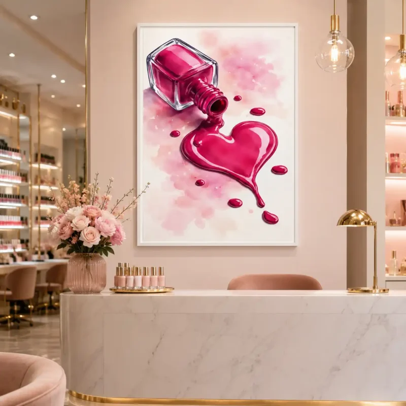
The reception wall is the first thing every client sees and the last thing they see before they leave. It sets the expectation on arrival and confirms the impression on departure. It is the single most important display surface in your entire salon — and most salons waste it completely.
A single large statement piece directly behind the reception desk immediately elevates every client’s first impression. It does not need to be complicated. A bold canvas print in your salon’s colour palette, a framed typographic quote relevant to your brand, or a custom sign featuring your salon name — any of these transforms a functional counter into a designed space.
The rule is one strong piece rather than several competing ones. Reception areas are high-traffic, high-distraction spaces. One clear focal point reads better than a gallery arrangement that requires the eye to settle before understanding it.
What works best here: a canvas print at least 24×36 inches, centred horizontally behind the desk, hung so the centre of the piece sits at standard eye level (57 to 60 inches from the floor).
2. Use the Funny Definition Prints That Clients Photograph on Repeat
If you want to understand what nail salon wall art actually generates social media shares, look at what appears in client posts consistently. It is almost never the abstract canvas or the botanical print. It is the funny text-based print that clients read while their nails dry, smile at, and photograph before they have even consciously decided to.
Dictionary definition style prints — the ones that define “nail technician” or “gel manicure” in mock academic terms with a knowing wink — hit a specific sweet spot. They are relevant to the environment, they are readable at a glance, they make clients feel understood, and they invite a photograph. Every photograph becomes a social media post. Every post is organic marketing for your salon that costs you nothing beyond the initial print.
Position these prints at nail stations, directly in the client’s eyeline while seated. The position where nails dry is the position where phones come out. Make sure something worth photographing is exactly there.
What works best here: the 10+ piece funny definition bundle gives you enough variety to rotate prints seasonally or position different designs at each station. The 3-set is ideal for a single station or a small studio with two or three workspaces.
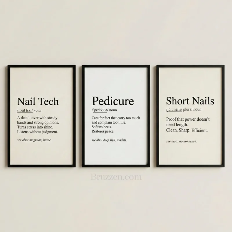
Pro tip: Change the prints at your stations every three to four months. Regular clients notice the change, comment on it, and feel that the salon is alive and evolving. It is the lowest-cost refresh available and it keeps the space feeling current.
3. Create a Gallery Wall Above Your Nail Stations
A row of nail stations with matching art above each one is one of the most consistently admired features in well-designed salons. It takes a functional work area and turns it into a designed space — the difference between a salon that feels set up and one that feels built.
The key is consistency. Matching prints in matching frames, uniformly spaced, at the same height above each station. The repetition is the point — it signals intentionality in a way that mixed frames and varied prints never quite achieve.
How to execute it:
Keep 2 to 3 inches between each frame. Use identical frames throughout — all black, all gold or all white. Choose prints that are related but not identical: the same series, the same colour palette, or the same design style. Hang so the bottom of each frame sits approximately 48 to 54 inches from the floor — high enough to clear station equipment, low enough to be in the client’s natural eyeline when seated.
For a five-station salon, a matching set of five prints in uniform frames creates a gallery-wall effect that photographs beautifully from any angle in the room.
What works best here: the 3-set or 5-set printable collections, printed to matching sizes and framed identically. Canvas prints in a coordinated series also work well and require no framing.
4. Turn One Wall Into a Social Media Backdrop
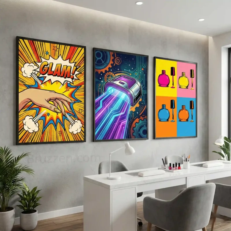
Every nail salon has at least one wall that clients photograph more than any other. Usually, it is the one directly behind the nail stations or the reception feature wall. If you have not deliberately designed that wall to be photographed, you are missing an opportunity that costs your competitors almost nothing to take advantage of.
A social media backdrop wall does not need to be elaborate. It needs to be visually cohesive, on-brand, and interesting enough that clients choose to include it in their photos rather than crop it out. A gallery arrangement of five to seven pieces in coordinating frames, a single large statement canvas, or a bold typographic print large enough to fill the frame — any of these transforms a background from neutral to notable.
The test is simple: stand where a client would stand to photograph their nails. Look at what is behind your hands in that shot. Is it something you would want in the background? If not, that is your highest-priority wall.
What works best here: a cohesive arrangement rather than a single piece — more visual interest, more shareable. Bold colours or strong typography photograph better than subtle or muted art in casual phone photography conditions.
5. Frame Your Brand with a Custom Salon Name Sign
Nothing communicates professionalism and permanence like your salon name on the wall in a material that means it. A custom metal sign featuring your salon name, your tagline, or both, is the highest single-investment piece of wall art any salon can make — and the one with the clearest commercial return.
Every photograph taken in your salon with your name visible in the background is branded content. Every client who posts their manicure with your sign behind it has just told their followers where they got it done. That is advertising that targets the exact audience most likely to become your clients — people who already trust the person recommending you.
Beyond the marketing value, a custom sign signals to clients that this salon is established, intentional and here to stay. It elevates perception in a way no stock print can replicate.
Custom laser-cut steel signs from Bruzzen come with a free design mockup — you review the design before anything is made, and you do not pay until you love it.
6. Use Art to Define Different Zones in Your Salon
Most nail salons are a single open space with multiple functions — waiting, reception, nail stations, drying area, treatment. Without deliberate design, these zones blur into each other and the space feels undifferentiated.
Wall art is one of the most effective and least disruptive ways to define distinct zones in an open plan salon. Different art in each area signals to clients — subconsciously, but clearly — that they have moved from one space to another.
Use warmer, more welcoming art in the waiting area. Use engaging, readable art (the funny definition prints, motivational quotes) at nail stations. Use calmer, more atmospheric art in any treatment or private booth area. Reserve bold statement pieces for reception and feature walls that face the entrance.
This zoning approach makes even a small single-room salon feel considered and layered. Clients may not be able to articulate why the space feels designed — but they will feel it.
Practical approach: you do not need different collections for each zone. A coordinated range used differently across zones — larger prints in waiting, smaller matched sets at stations, one statement piece at reception — creates differentiation without incoherence.
7. Go Bold with a Feature Wall
If your salon has one wall that is larger, more prominent, or more visible from the entrance than the others, make it a feature. A feature wall does not need to be painted a different colour or covered in wallpaper — a strong art arrangement can achieve the same effect entirely with framed pieces.
A salon feature wall typically works best with one of two approaches. The first is a single oversized piece — a canvas or print large enough to fill the wall with confidence, requiring nothing else around it.
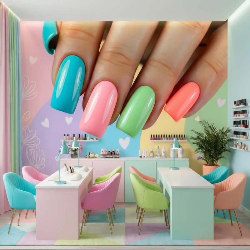
The second is a curated gallery arrangement of seven to twelve pieces, mixed in size but unified in colour or frame finish, covering the wall in a way that reads as a single composition from across the room.
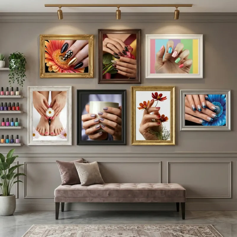
Both approaches photograph brilliantly. Both give clients something to look at and comment on. Both signal that this is a salon where someone has paid attention to every surface.
For a feature wall behind reception on a budget, a set of three large-format printable downloads printed at A1 size and framed in matching frames achieves a professional result for under $100.
8. Seasonal Updates Keep the Space Feeling Fresh
One of the most common frustrations salon owners share is that their decor looks great on opening day and progressively less exciting as the months pass. Regular clients stop seeing it. The space starts to feel static. The energy that was so deliberate on launch day quietly evaporates.
The solution is not a full redesign every season. It is a planned rotation of lower-commitment pieces — typically the station prints and waiting area art — that keeps the walls feeling current without touching the larger investment pieces at reception and feature walls.
Printable art makes this approach genuinely practical. Buy a bundle once and you have enough designs to rotate quarterly for two or three years. Print new designs at a local print shop for a few pounds each and swap them into existing frames. The frames stay. The feel changes. Clients notice.
A practical seasonal rotation:
Keep your reception statement piece and any custom signage permanent. Rotate the station prints and waiting area art quarterly — spring florals through March and April, bold brights through summer, warm earth tones in autumn, festive or minimal in December and January. The core identity stays consistent. The details shift enough to feel alive.
What works best here: a printable bundle large enough to provide variety across multiple seasons. The 10+ piece bundle is the practical minimum for a salon wanting quarterly rotations.
9. Think About the Drying Station Separately
The drying station is where clients spend time with nothing to do — hands immobilised, unable to scroll their phone. This is your most captive audience, your longest dwell time, and typically the most neglected wall in the salon.
Art at the drying station has the longest uninterrupted viewing time of any surface in your salon. Clients will read every word of a text print while they wait. They will notice details in an illustration that they would walk past anywhere else. They are, briefly and completely, your audience.
Use this. Position your most engaging, most readable, most shareable art at or near the drying station. The funny definition prints are the obvious choice — they fill exactly the amount of reading time available and they reward the reader with a smile at the end. But any art that gives the viewer something to genuinely look at rather than passively occupy the wall will perform better here than the decorative-but-unmemorable alternative.
Placement: at eye level for a seated client — approximately 40 to 48 inches to the centre of the piece from the floor. If clients use a UV lamp on a table, the art should sit above the lamp at comfortable reading height.
10. Do Not Forget the Small Details
The nail salons clients remember most vividly are almost never the ones that did one dramatic thing well. They are the ones where everything was considered — including the details that most people do not think about until they are missing.
The small print above the hand washing station. The framed sign on the back of the treatment room door. The quote print in the staff bathroom that clients occasionally use. The art in the corridor between reception and stations. These are not primary display surfaces but they are surfaces clients see — and a well-chosen small print in an unexpected place creates a disproportionate impression of care and intentionality.
A single 8×10 inch printable framed in a quality frame costs almost nothing. In a position where no client expects to find considered art, it says everything about the standard your salon holds itself to.
Budget allocation suggestion: spend 80% of your art budget on the primary surfaces — reception, feature wall and nail stations. Spend the remaining 20% on the details. The primary surfaces create the impression. The details confirm it.
Where to Start: A Practical Checklist
If you are reading this with a salon to decorate and not knowing where to begin, work through this in order:
Step 1 — Reception wall first. This is what clients see first and what appears in every photo taken at check-in or check-out. One large piece. On brand. Hung correctly.
Step 2 — Nail stations second. These walls get the most viewing time in your salon. Consistent, matching art above each station. Readable. Interesting enough to photograph.
Step 3 — Identify your feature wall. The largest or most visible wall in your salon. One strong arrangement. This is the one that appears in wide-angle shots and in any coverage your salon receives.
Step 4 — Fill the details. Drying station, waiting area, corridor, staff area. Lower investment, higher impact than most people expect.
Step 5 — Plan your first seasonal refresh. Decide when you will rotate the station and waiting area art. Put it in your calendar now. Quarterly is ideal. Twice yearly is realistic for most salons.
Ready to Start?
Browse the complete nail salon wall art range at Bruzzen — framed canvas prints, posters, instant download printable sets (including the 10+ funny definition bundle and the 3-set), and large format photos for salon feature walls.
Every product ships fast across the US. Printables are available for instant download — purchase now and print today.
And if you want something made specifically for your salon — a custom sign with your name, your logo, your tagline, or a bespoke design that no other salon will have — every custom order at Bruzzen includes a free design mockup. You see it before we make it. You do not pay until you love it.
Explore Bruzzen’s Nail Salon Wall Art
Related Reading
- Nail Salon Wall Decor Ideas: Art, Prints and Décor for Every Nail Studio
- The Perfect Wall Art Placement Guide — How to Hang Art Like a Designer (Free Download)
- Custom Wall Art — Personalized Metal Signs for Salons and Studios
- Shop All Salon and Beauty Wall Art
Want more wall art ideas, room styling tips and first access to new Bruzzen collections? Join the list — free.
Subscribe Free →