

Wall Art Tips & Advice, Blog, Wall Decorating Ideas
The Psychology Behind Color Choices in Wall Art: How Hues Affect Your Emotions
Colors shape how you feel in your home. The wall art you choose brings specific colors into your space. These colors affect your mood, energy, and behavior every day. Understanding color psychology helps you create rooms that support your lifestyle.
How Colors Impact Your Mind
Your brain processes color in milliseconds. This happens before you consciously notice what you see. Different wavelengths of light trigger different responses in your brain. These responses affect your emotions and physical state immediately.
Blue light increases alertness and helps you focus. Red light raises your heart rate and creates excitement. Green light reduces eye strain and mental fatigue. Each color creates specific changes in your body and mind.
Wall art provides a smart way to use color psychology. Unlike painting entire walls, artwork lets you place colors strategically. Even small art pieces can change how a room feels. The concentrated color in the artwork creates strong psychological effects.
Understanding Each Color’s Power
Red Creates Energy and Passion
Red commands attention instantly. It raises your heart rate and stimulates your appetite. Red creates feelings of excitement, warmth, and urgency. Deep red shades like burgundy add sophistication to dining rooms. Bright reds work well in social spaces but need careful balance.

Use red wall art in dining rooms to encourage conversation and appetite. Add red to living rooms for energy and social interaction. Place red art in home gyms to boost motivation. Avoid red in bedrooms where you need calm and rest.
Blue Promotes Calm and Focus
Blue lowers blood pressure and reduces stress. Light blue creates serenity and peace. Medium blue improves focus and clear thinking. Navy blue conveys stability and professionalism.
Blue wall art works perfectly in bedrooms for better sleep. Use blue in home offices to enhance productivity. Add blue to bathrooms for a spa-like feeling. Place blue art in reading nooks to create a calm and focused environment.
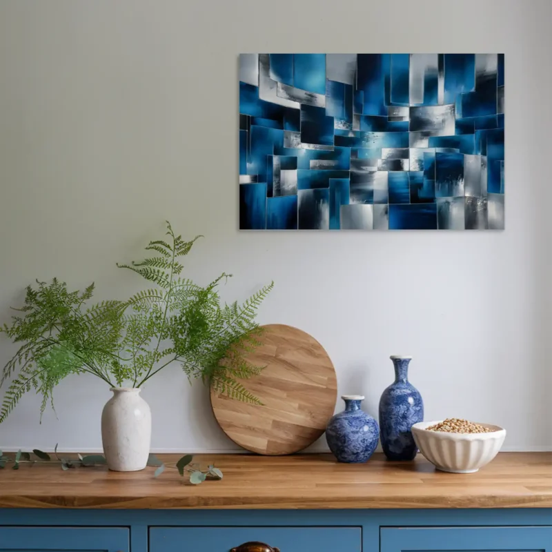
Green Brings Balance and Harmony
Green balances warm and cool color properties. It connects you to nature and restores mental energy. Green reduces anxiety and eye strain. This color promotes creativity without over stimulation.
Green wall art suits any room in your home. Use green in living rooms for harmony. Add green to offices for sustained focus. Place green art in bedrooms for peaceful rest.
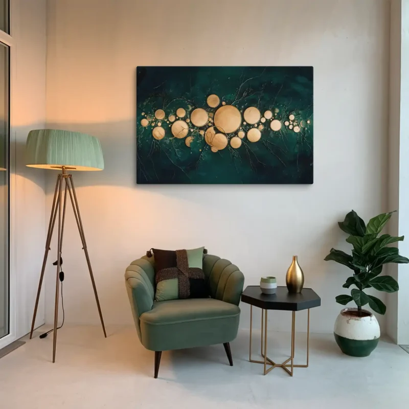
Yellow Sparks Joy and Creativity
Yellow stimulates mental activity and boosts mood. Soft yellows create warm, welcoming spaces. Bright yellows provide energy but need careful use. Golden yellows add sophistication while maintaining positive effects.
Yellow wall art brightens kitchens and breakfast areas. Use yellow in creative spaces and studios. Add yellow to children’s rooms for happiness. Limit intense yellows in bedrooms to avoid overstimulation.
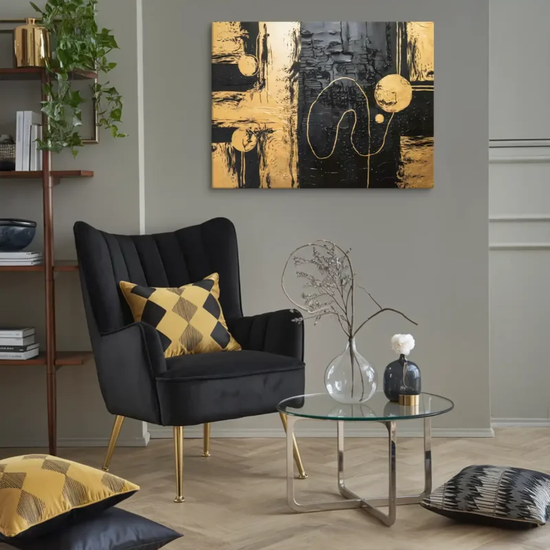
Purple Inspires Luxury and Imagination
Purple stimulates creativity and introspection. Lavender shades calm like blue but add warmth. Medium purples boost imagination and creativity. Deep purples create drama and sophistication.
Purple wall art enhances bedrooms and meditation spaces. Use purple in creative studios for inspiration. Add purple to formal areas for elegance. Balance purple with neutral colors for best results.
Orange Encourages Social Connection
Orange combines red’s energy with yellow’s happiness. It stimulates appetite and boosts confidence. Orange encourages social interaction and creativity. This color creates warmth without red’s intensity.
Orange wall art energizes social areas and kitchens. Use orange in creative spaces for enthusiasm. Add orange to playrooms for warmth. Balance orange with cool colors to prevent overwhelm.
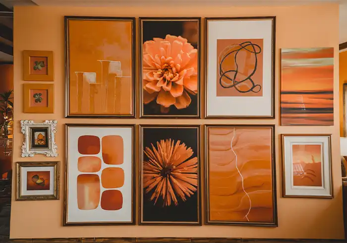
White Opens Up Your Space
White creates feelings of cleanliness and simplicity. It makes small rooms feel larger and brighter. White reflects natural light throughout your space. Pure white can feel stark without warm accents or textures.
White wall art works as a foundation for any color scheme. Use white frames to make colorful art pop. Add white abstract pieces to crowded spaces for visual breathing room. Pair white art with wood textures for warmth.
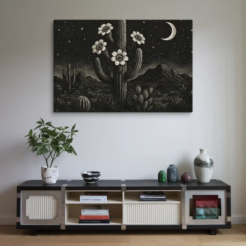
Black Adds Drama and Depth
Black conveys power, mystery, and elegance. It makes other colors appear more vibrant by contrast. Black creates focal points that draw the eye. Too much black can feel heavy in small spaces.
Black wall art works best as an accent in galleries. Use black frames for a sophisticated presentation. Add black and white photography for timeless appeal. Place black art against light walls for maximum impact.
Gray Creates Modern Balance
Gray offers sophistication without the starkness of black or white. Warm grays (greige) feel cozier than cool grays. Gray provides the perfect neutral backdrop for bold art. Different gray shades create depth without color.
Gray wall art suits contemporary and minimalist spaces. Use gray in offices for professional calm. Add gray abstracts to busy rooms for visual rest. Layer multiple gray tones for sophisticated depth.
Brown and Beige Ground Your Space
Brown connects your home to nature and the earth. Beige creates warmth without overwhelming other colors. These colors provide stability and comfort. Earth tones make spaces feel cozy and inviting.
Brown wall art works in rustic and traditional interiors. Use beige for transitional spaces between rooms. Add wood-framed art for natural texture. Combine browns with greens for nature-inspired themes.
Pink Softens and Energizes
Soft pink creates calming, nurturing atmospheres. Hot pink adds playful energy and fun. Blush tones provide warmth without red’s intensity. Pink can be sophisticated when used strategically.
Pink wall art transforms bedrooms into peaceful retreats. Use soft pink in nurseries for gentle comfort. Add bold pink to creative spaces for inspiration. Balance pink with gray or navy for mature elegance.
Gold and Metallic Shine with Luxury
Gold suggests wealth, celebration, and glamour. Metallic finishes catch light and create movement. These colors add warmth to cool color schemes. Metallics work best as accents rather than dominant colors.
Gold wall art elevates formal dining rooms instantly. Use metallic frames to add subtle luxury. Add gold leaf details for artistic sophistication. Combine metallics with deep colors for rich contrast.
Choosing Colors for Each Room
Living Room Colors
Your living room needs colors that encourage conversation and relaxation. Warm neutrals create welcoming atmospheres. Soft blues promote calm discussion. Earth tones provide grounding comfort.
Choose large statement pieces to anchor your color scheme. Create gallery walls with balanced color proportions. Place art where it enhances social interaction. Avoid overly stimulating color combinations.
Bedroom Colors
Bedrooms require colors that support rest and relaxation. Cool blues naturally lower the heart rate. Soft greens provide balance and restoration. Warm neutrals create cozy retreat spaces.
Position art opposite the bed rather than above it. Choose calming imagery and gentle colors. Avoid bright yellows and intense reds. Focus on colors that promote quality sleep.
Home Office Colors
Office spaces need colors that boost focus and productivity. Blue improves concentration and clear thinking. Green reduces eye strain during long work sessions. Yellow accents spark creativity when used sparingly.
Select art that inspires without distracting. Place pieces visible during breaks. Choose colors that support sustained mental activity. Avoid overly relaxing colors that cause drowsiness.
Kitchen and Dining Room Colors
Food spaces benefit from appetite-stimulating colors. Warm colors create cozy meal environments. Red encourages conversation and appetite. Earth tones connect to food’s natural origins.
Choose food-themed art or warm landscapes. Select pieces that enhance social gatherings. Use colors that make meals more enjoyable. Balance stimulating colors with calming neutrals.
Creating Balanced Color Schemes
The 60-30-10 Rule
Professional designers use this proven formula. Allocate 60 percent to your dominant color. Use 30 percent for secondary colors. Reserve 10 percent for accent colors.
Wall art typically provides your secondary color. This creates visual flow throughout the room. The rule ensures balance while allowing impact. Your art becomes a crucial design element.
Working with Color Combinations
Color combinations transform rooms from ordinary to extraordinary. The right pairing creates harmony or exciting contrast. Understanding how colors interact helps you make confident choices. Your wall art can introduce these combinations effectively.
Monochromatic Schemes use different shades of one color family. A blue room might feature navy walls, medium blue furniture, and sky blue art. This approach creates sophisticated calm without visual confusion. Add texture through canvas prints, metal prints, or framed pieces to prevent monotony.
For example, a green monochromatic bedroom could include sage green walls, forest green bedding, and mint green botanical prints. The varying intensities create depth while maintaining peaceful unity. This scheme works especially well in bedrooms and meditation spaces where calm matters most.
Complementary Colors sit directly opposite on the color wheel. These pairs create maximum visual impact when used together. Blue and orange energize without clashing. Purple and yellow create unexpected sophistication. Red and green provide festive drama beyond holiday decor.
The key to complementary schemes lies in proportion. Use the 70-30 ratio where one color dominates. A predominantly blue living room gains energy from orange throw pillows and sunset artwork. This prevents the visual tension that equal amounts create.
Analogous Colors sit next to each other on the color wheel. Blue, blue-green, and green create natural harmony. Red, red-orange, and orange provide warm energy. Yellow, yellow-green, and green bring spring freshness indoors. These combinations feel naturally pleasing because they appear together in nature.
Consider a coastal theme using blue, blue-green, and green wall art. Ocean photography, abstract waves, and seafoam prints work together seamlessly. The colors flow into each other without harsh transitions. This creates rooms that feel cohesive and intentional.
Triadic Color Schemes use three colors equally spaced on the color wheel. Red, yellow, and blue create primary power. Orange, green, and purple offer secondary sophistication. These schemes provide a vibrant variety while maintaining balance. Use one color as dominant with the others as accents.
A child’s playroom might feature primarily yellow walls with red and blue artwork. Educational posters, abstract shapes, and playful prints distribute the colors evenly. This creates stimulation without chaos. The key is maintaining equal visual weight among the three colors.
Split-Complementary Schemes combine one color with two adjacent to its complement. Blue pairs with red-orange and yellow-orange instead of pure orange. This creates contrast with more nuance than straight complements. The result feels sophisticated yet dynamic.
For instance, a dining room could feature blue-gray walls with terracotta and golden yellow art. Wine country landscapes or abstract pieces in these tones create warmth. The scheme provides energy for entertaining while avoiding harsh contrasts.
Popular Color Combinations That Always Work:
- Navy and gold create timeless elegance
- Sage green and blush pink offer modern softness
- Charcoal gray and mustard yellow provide contemporary pop
- Cream and terracotta bring desert warmth
- Teal and coral deliver tropical energy
- Black and white with any accent color stays classic
Complete Color Psychology Reference Table
| Color Category | Color | Psychological Effect | Best Room Placement | Avoid In |
| Warm Colors (Energetic & Stimulating) | Red | Passion, energy, excitement, increases heart rate, stimulates appetite | Dining room, living room, home gym | Bedroom, meditation space |
| Orange | Creativity, enthusiasm, warmth, social confidence | Kitchen, playroom, creative studio | Relaxation areas, bedroom | |
| Yellow | Happiness, optimism, mental clarity, boosts mood | Kitchen, home office, breakfast nook | Intense yellows in bedrooms | |
| Cool Colors (Calming & Soothing) | Blue | Calmness, focus, serenity, lowers stress and blood pressure | Bedroom, bathroom, home office | Dining room (may suppress appetite) |
| Green | Balance, renewal, harmony, reduces eye strain | Living room, bedroom, home office | No major restrictions | |
| Purple | Creativity, luxury, spirituality, imagination | Bedroom, creative space, meditation room | Kitchen (may suppress appetite) | |
| Neutral Colors (Versatile & Grounding) | White | Cleanliness, simplicity, spaciousness, openness | Any room, especially small spaces | May feel cold without warm accents |
| Gray | Sophistication, neutrality, balance, modernity | Living room, office, contemporary spaces | May feel depressing if overused | |
| Black | Power, mystery, elegance, drama | Accent walls, gallery spaces | Small rooms (can feel oppressive) | |
| Beige/Brown | Warmth, stability, comfort, earthiness | Living room, study, rustic spaces | May feel dated without modern elements | |
| Bold & Playful Colors | Pink | Soft pink: calming, nurturing; Hot pink: playful, energetic | Bedroom, nursery, dressing room | Traditional office spaces |
| Teal/Turquoise | Refreshing, invigorating, balanced, tropical | Bathroom, coastal-themed spaces | Formal dining rooms | |
| Gold/Metallic | Luxury, glamour, warmth, celebration | Formal dining room, living room accents | Overuse can feel gaudy |
Practical Selection Tips
Assess Your Space First
Natural light affects how colors appear. North-facing rooms feel cooler naturally. South-facing rooms appear warmer. Artificial lighting also changes color perception.
Room size influences color choice. Light colors make small spaces feel larger. Dark colors create intimacy in large rooms. Consider existing decor before adding new art.
Balance Psychology with Preference
Color psychology provides helpful guidelines. Personal preferences matter equally. Cultural background influences color perception. Trust your instincts about what feels right.
Your needs change over time. Young professionals need different colors from retirees. Be ready to adapt your choices. Let your art collection evolve with you.
Stay Within Your Budget
Quality prints provide psychological benefits affordably. Online galleries offer color-focused options. Create your own abstract color art. Frame colored paper for instant impact.
Rotate art seasonally to refresh your space. Build your collection gradually over time. Focus on colors that serve your primary goals. Quality matters more than quantity.
Common Mistakes to Avoid
Too Many Bold Colors
Multiple intense colors create visual chaos. This negates positive psychological benefits. Focus on two or three main colors. Let neutral colors provide visual rest.
Each color needs space to create impact. White space enhances color effects. Balance prevents overwhelming your senses. Simplicity often works better than complexity.
Ignoring Room Function
Match colors to how you use each space. Energizing colors suit active areas. Calming colors belong in rest spaces. Consider when rooms get used the most.
Morning spaces benefit from energizing yellows. Evening areas need calming blues or greens. Align colors with daily activities. Support your routines through color choice.
Current Color Trends for 2025
Deep, saturated colors are gaining popularity. Rich sage greens create sophisticated calm. Inky blue-grays add modern depth. Warm terracotta tones bring earthy comfort.
Bold burgundies make dramatic statements. These colors balance professional and personal style. They move away from stark white walls. Modern spaces embrace emotionally resonant colors.
This trend acknowledges an important truth. Sterile environments reduce productivity. Personalized spaces enhance well-being. Color creates emotionally supportive workspaces. Rich hues humanize our living areas.
Making Color Work for You
Color psychology transforms living spaces effectively. Choose colors that support your daily life. Balance stimulation with relaxation thoughtfully. Let each room serve its intended purpose.
Start with one room at a time. Observe how colors affect your mood. Adjust your choices based on results. Build environments that truly support you.
Your wall art does more than decorate. It shapes your emotions and behaviors daily. Select colors mindfully for each space. Create a home that energizes, soothes, and inspires you.
Remember that small changes create big impacts. Even one carefully chosen piece transforms a room. Trust the power of color psychology. Let your wall art work for your well-being.
Want more wall art ideas, room styling tips and first access to new Bruzzen collections? Join the list — free.
Subscribe Free →