Blog, Wall Decorating Ideas
How Far Apart Should You Hang Pictures? Wall Art Spacing Guide for Any Layout
Good art spacing makes any room look better. Bad spacing makes walls look messy. This guide shows you the simple rules for hanging pictures the right way.
Basic Wall Art Spacing Rules
The main rule is simple: Leave 2 to 6 inches between picture frames. This range keeps your wall art connected while giving each piece room to breathe.
Small pictures (under 16 inches): Use 2-3 inches apart
Medium pictures (16-24 inches): Use 3-4 inches apart
Large pictures (over 24 inches): Use 4-6 inches apart
These measurements work for most homes. You can adjust them based on your specific situation.
What Affects Spacing
Your wall size matters most. Big walls can handle wider gaps up to 6 inches. Small walls require smaller gaps, around 2-3 inches, to keep pictures looking connected.
Your frame style matters too. Thick frames create more visual weight. They need an extra 1-2 inches of space compared to thin frames. This prevents the wall from looking too busy.
The room size also matters. Small rooms look better with closer spacing because everything feels more intimate. Large rooms can handle wider gaps without pictures looking lost.
Consider your ceiling height as well. High ceilings can support slightly wider spacing. Low ceilings work better with tighter arrangements.
Spacing Two Pictures Side by Side
Put two pictures 2-3 inches apart. This creates a unified look that works well above sofas, beds, and tables. The close spacing makes the two pieces feel like they belong together.
For very large pictures, use 4 inches between them. This gives each piece more room and prevents the display from feeling cramped. Large art needs more breathing space.
Match your pictures by size when possible. Two same-sized frames look more balanced than mixed sizes. If you must mix sizes, align the center points of both pictures.

Height tip: Hang pictures so the center sits 57-60 inches from the floor. This puts art at natural eye level for most people.
Tip: When combining your two pictures, they should cover 50-75% of the furniture width below them. This creates a proper proportion between your art and furniture.
How Much Space Between 3 Pictures on the Wall?
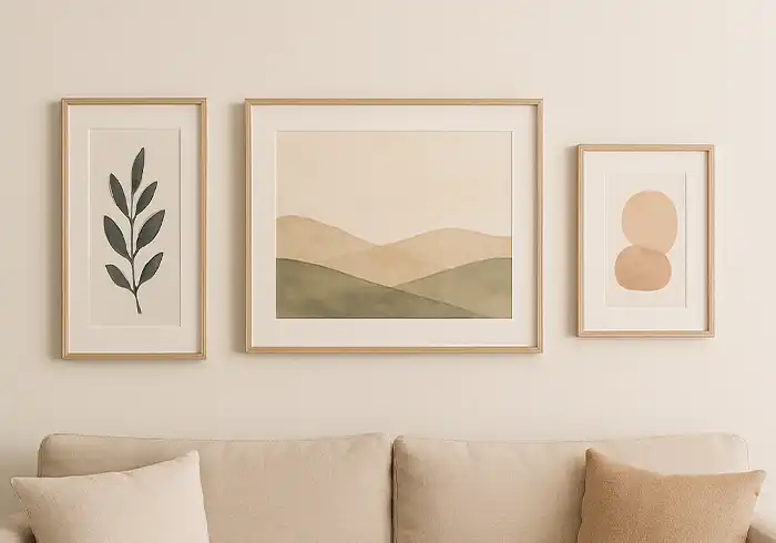
Keep the gaps even between all three pictures. Use 2-3 inches for most cases. Equal spacing creates a clean, organized look that feels intentional.

For a casual look, you can stagger the heights slightly. Use 3-4 inches between frames when you do this. The wider spacing balances the uneven heights.
Make sure the total width covers 50-75% of the furniture below. Measure your sofa or table first. Then, plan your spacing so the whole group fits this rule.
Center picture rule: Make your center picture the focal point. It can be larger than the side pictures or contain the most important image. The side pictures should support and balance the center one.
Theme matching: Use pictures with similar colors, subjects, or frame styles. This creates harmony even when the exact sizes differ.
Alignment options: You can align the tops, bottoms, or centers of all three pictures. Center alignment usually looks best with differently sized frames.
Spacing Five Pictures(Gallery Walls)
Five pictures work best in two layouts. Choose based on your wall space and picture sizes.
Grid style: Keep 2-3 inches between all pictures, both up and down and side to side. This creates a clean gallery wall effect. Grid layouts work best with similarly sized pictures and frames.
Row style: Keep 2-4 inches between each frame going across. This creates a horizontal band of art. Row layouts work well above long furniture like sofas or dressers.
Mix different sizes by lining up either the tops or the bottoms of all frames. Bottom alignment usually looks more stable and grounded.

Planning your layout: Start with your largest or most important picture. Place it slightly off-center for visual interest. Build the rest of your display around this anchor piece.
Color balance: Spread similar colors across your display. Don’t group all dark pictures on one side. This creates better visual weight distribution.
Frame consistency: Use the same frame style and color for the cleanest look. Mixed frames can work, but require more careful planning to avoid visual chaos.
Vertical Art Rules
Tall, narrow pictures can sit closer together. Use 1.5-2 inches between them.
Vertical pictures work great:
- Next to windows or mirrors
- In narrow wall spaces
- In hallways
Horizontal Art Rules
Wide pictures need more space. Use 3-4 inches between horizontal art pieces. The wider format needs extra breathing room to avoid feeling crowded.
Horizontal pictures work best:
- Above large furniture like sofas, beds, or long dressers
- In wide open wall areas with plenty of space
- Over beds and dining room furniture
- To make narrow rooms appear wider
Landscape advantage: Horizontal pictures naturally suit landscape photos, cityscapes, and panoramic views. These subjects look more natural in wide formats.
Eye movement: Horizontal arrangements encourage the eye to move left and right. This creates a calming, restful feeling in bedrooms and living areas.
Furniture relationship: Horizontal art should be roughly two-thirds the width of the furniture below it. This creates proper visual proportion and prevents the art from looking too small or too large.
Pairing with vertical elements: Balance horizontal art with vertical elements in the room, like tall lamps, plants, or furniture. This prevents the space from feeling too flat.
Mixing Vertical and Horizontal Pictures

You can mix different-shaped pictures together. This creates dynamic, interesting displays. Follow these rules for the best results:
- Line up the center points of all pictures at the same height
- Keep 2-3 inches between all frames, regardless of shape
- Start with your biggest piece first as the anchor
- Build the rest around it, balancing visual weight
Visual balance: Place heavier or darker pictures toward the bottom and right side of your arrangement. The eye naturally moves in this direction, so the weight here feels stable.
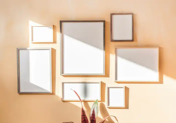
Odd numbers work better: Use 3, 5, or 7 pieces instead of even numbers. Odd groups feel more natural and less formal than even arrangements.
Color coordination: Repeat colors across your mixed arrangement. If one picture has blue elements, include blue in at least one other piece. This ties the whole display together.
Frame harmony: Use similar frame styles or colors even when mixing picture orientations. This creates unity despite the different shapes and sizes.
Pro Tips for Perfect Spacing
Test first: Cut paper shapes the same size as your pictures. Tape them to the wall before hanging anything. This lets you try different arrangements without making holes in your wall.
Use a level: Mark a straight line at 60 inches high with a pencil and level. This helps you hang everything straight and at proper eye level. Crooked pictures ruin even perfect spacing.
Check from doorways: Step back and look at your wall from where people enter the room. This is how most guests will see your display. Adjust spacing if anything looks uneven from this view.
Group small art: Place tiny pictures very close together (1.5-2 inches) to create a cohesive, single piece. Small art gets lost if spread too far apart on large walls.
Consider lighting: Make sure your spacing allows light to reach each picture evenly. Avoid placing pictures where furniture or room features will cast shadows on them.
Measure twice, hang once: Write down your measurements before starting. Mark the wall positions with pencil dots. Double-check all measurements before making any holes.
Use quality hardware: Invest in proper picture hanging hardware rated for your frame weights. Poor hardware leads to crooked or fallen pictures that ruin your careful spacing.
Common Mistakes to Avoid
Too close: Gaps under 2 inches make your wall look crowded and busy. Pictures need breathing room to be appreciated individually. When frames nearly touch, the display feels cluttered instead of curated.
Too far apart: Gaps over 6 inches make pictures look disconnected and random. They stop feeling like a planned arrangement and start looking like separate decorations that happen to share a wall.
Mixed-up centers: When mixing different-sized pictures, always line up the center points. This creates a stable horizontal line that holds the arrangement together. Misaligned centers make displays look accidental and sloppy.
Ignoring furniture: Art that doesn’t relate to the furniture below it looks floating and disconnected. Always consider the visual relationship between your pictures and nearby furniture pieces.
Wrong hanging height: Pictures hung too high or too low break the connection with the room. The 57-60 inch center height rule works for most situations and keeps art at comfortable viewing levels.
Quick Reference Guide
- Two pictures: 2-4 inches apart
- Three pictures: 3-5 inches apart
- Five pictures: 2-4 inches apart
Vertical art: 2-3 inches apart
Further Reading
- The Benefits of Canvas Wall Art: Why It’s a Must-Have for Every Home
- How to Hang Art and Pictures without Nails/Drilling
- How to Hang Metal Wall Art With or Without Nails & Hooks
- How to Hang Acrylic Prints Wall Art
- How to Hang Canvas Prints & Paintings
- Complete Guide to Hanging Art from Ceiling: Transform Your Space with Suspended Artwork
- Wall Decor Ideas for Living Room: Modern, Elegant & Cheap Ways to Style Any Space
- 50+ Small Wall Decoration Ideas: Maximizing Tiny & Long Narrow Spaces
- Top 7 Benefits of Metal Wall Art: Why It’s Perfect for Indoor & Outdoor Spaces

