

Wall Decorating Ideas
How to Choose Art for Your Home: Size & Room Guide
You’re standing in front of a blank wall with a dozen browser tabs open, and every piece looks right until you picture it actually hanging there. Most guides tell you to “trust your taste,” which doesn’t help when taste and a 90-inch sectional disagree. Here’s how to choose art for your home using the same size, material, and color decisions a print shop that builds across five materials actually relies on.
Choose art for your home by sizing it to 60–75% of the furniture width below it, matching the material to the room’s humidity and light, and picking a color that echoes one existing tone in the room. Get the size wrong and even great art looks like an afterthought; get the material wrong and it won’t survive the room. A living room piece, a bathroom piece, and an office piece each need a different answer.
Contents
How Do You Choose the Right Size Art for Your Home?
Size your art to 60–75% of the width of the furniture or wall segment it hangs above. Below 50% the piece reads as lost; above 80% it overwhelms the wall. For an 84-inch sofa, that means art between 50 and 63 inches wide.
This ratio holds whether you’re choosing wall art for a single feature piece or a gallery wall — a grouped arrangement of multiple smaller frames treated as one visual unit. Measure the full footprint of the arrangement, frames and gaps included, against the furniture below it. Bruzzen’s free wall art sizing calculator runs this math for your exact measurements if you’d rather not do it by hand.
How High Should You Hang Art in Your Home?
Hang the center of your art 57 to 60 inches from the floor in open wall space. Over a sofa, bed, or console, use 6 to 12 inches above the furniture instead — and this isn’t an arbitrary number.
Adults in the U.S. measure an average 68.9 inches (men) and 63.5 inches (women) in standing height, per the CDC’s National Health and Nutrition Examination Survey. That data explains why a 57-to-60-inch center consistently lands at eye level for most adult viewers.
Above furniture, the furniture sets the anchor point, so the 6-to-12-inch gap overrides the 57-inch rule. Bruzzen’s hanging height formula covers sloped ceilings and stairwells.
Spacing multiple frames instead of one piece? Keep gaps between 2 and 3 inches for a cohesive gallery wall. Bruzzen’s wall art spacing guide covers grids and staggered layouts.
What Material Should You Choose for Each Room?
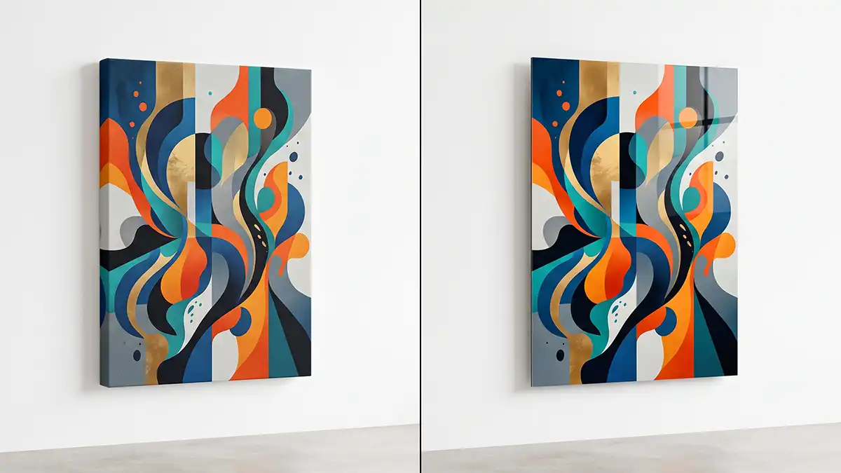
Match the print material to the room’s humidity and light exposure. The wrong material fades or warps regardless of how much you like the image, and most decor guides skip this step entirely.
| Room condition | Best material | Why it works |
|---|---|---|
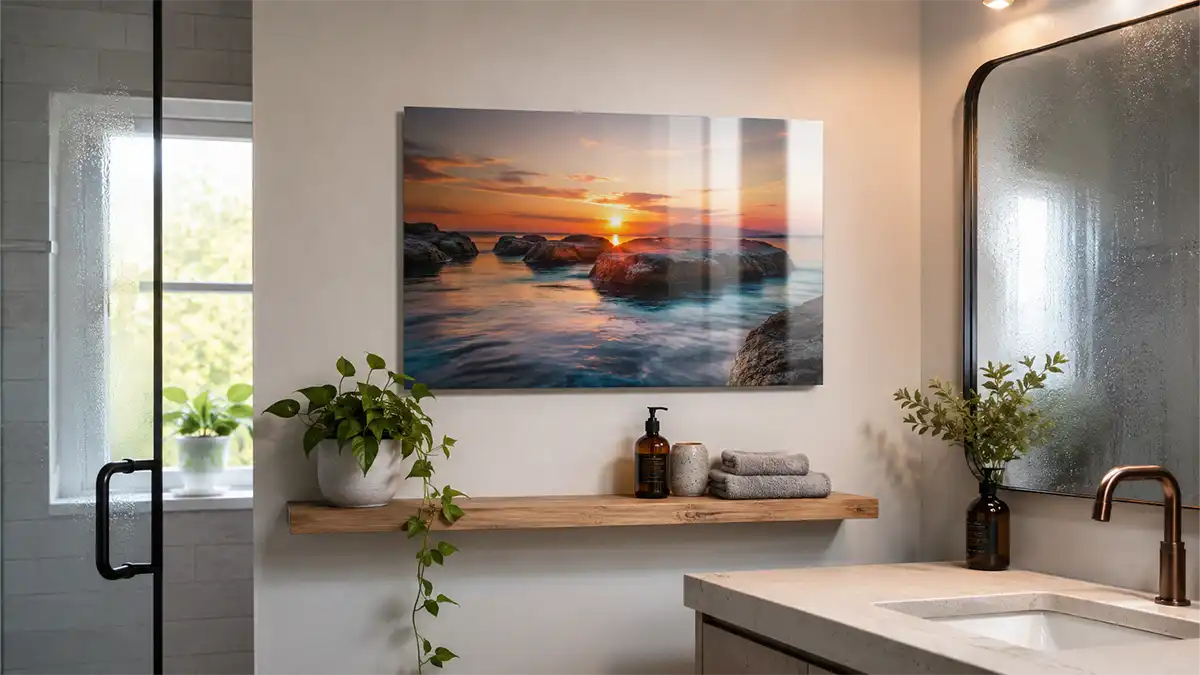
| Bathroom, laundry room (high humidity) | Aluminum metal print | Moisture-resistant surface won’t warp or grow mold the way canvas fibers can |
| South-facing sunroom or window wall | Acrylic print, UV-filtering face | The acrylic layer adds UV protection over the ink that bare canvas doesn’t have |
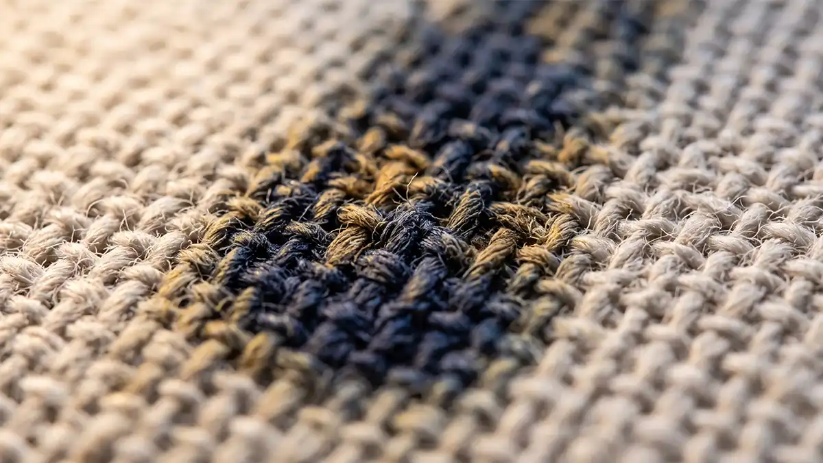
| Living room, bedroom (stable, moderate light) | Canvas print | Canvas holds color well for roughly 5 to 10 years under normal indoor light |
| Home office, hallway (low light, dry climate) | Framed paper or giclée print | A giclée print — a fine-art-grade inkjet print on archival paper — stays sharp without special coating when light stays low |
This table serves one decision: which material survives your specific wall, not which one photographs best online.
The Getty Conservation Institute’s research on light and museum materials shows that cumulative exposure, more than direct sun alone, causes prints and works on paper to fade, with conservators keeping sensitive paper-based prints under roughly 50 lux of continuous light.
Metal wins over canvas in a bathroom for one reason: canvas fiber absorbs ambient moisture and can bow within a single humid season, while an aluminum print’s sealed surface doesn’t. Compare both in Bruzzen’s metal vs. canvas prints comparison. For direct-sun walls, the acrylic vs. canvas prints breakdown covers which holds color longer under glass.
How Do You Match Art to Your Room’s Color Scheme?
Pick a piece that repeats one color already in the room — a throw pillow, a rug edge, a curtain — rather than matching the whole palette exactly. An exact match reads flat; a single echoed tone reads intentional.
A peer-reviewed study of 443 university residents living for over a year in six dormitory buildings identical except for interior color found blue was the most preferred color overall, and that residents who rated themselves as calmer were more likely to prefer blue interiors.
Color sets the emotional tone of a room before anyone reads the image itself. Cooler tones support focus in a home office; warmer tones read as inviting in a living room built for entertaining. Bruzzen’s color psychology in wall decor page breaks this down by hue.
Should wall art match the furniture exactly? No — match one accent color, not the whole upholstery, or the piece disappears into the room instead of anchoring it.
How Do You Choose Wall Art for a Living Room?
Choose living room art by starting with the sofa wall and sizing the piece to 60–75% of the sofa’s width. Then pick a material rated for daily light exposure, since living rooms get more cumulative sun than bedrooms.
A 90-inch sectional needs art in the 54-to-68-inch range — a single large piece or a gallery arrangement, not a 16×20 canvas floating alone. South- or west-facing rooms favor acrylic or metal over unprotected canvas. Bruzzen’s living room wall decor ideas page has layout examples.
Decision Support: Choose by Room and Condition
Use this table to pick a starting point by room instead of scrolling galleries for style inspiration first — it’s the decision that comes before taste, not after it.
| Room | Size ratio target | Placement priority |
|---|---|---|
| Living room (above sofa) | 60–75% of sofa width | Center at 57–60 in., or 6–12 in. above the sofa back — whichever sits higher |
| Bedroom (above bed) | 50–66% of headboard width | Avoid high-contrast art directly above the pillow line |
| Home office | 40–60% of desk wall segment | Frame under glass to cut monitor glare |
This table serves the decision of where to start measuring — pick your room, then apply the ratio to your actual furniture.
What’s the Biggest Mistake People Make When Choosing Wall Art?
The single biggest mistake is buying art too small for the wall, driven by a fear of going “too big.” A piece under 50% of the furniture width reads as an afterthought no matter how good the image is.
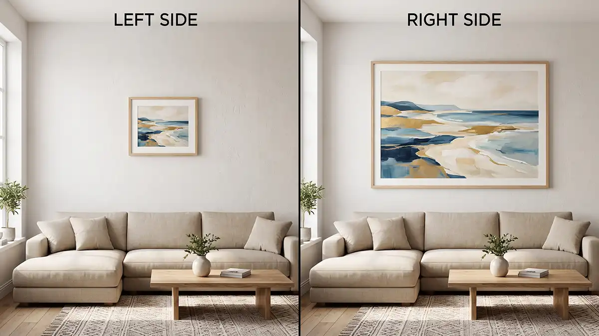
- Buying too small: A 16×20 print over a queen bed’s 60-inch headboard leaves 20+ inches of bare wall on each side, and the room reads unfinished even after everything else is styled.
- Matching frame color to the wall instead of the furniture: This flattens the room into one tone with no visual anchor point.
- Skipping the material-to-room and light match: Canvas in a steamy bathroom can warp within a year; a print facing an unfiltered south window can fade unevenly along its exposed edge in as little as 12 months.
- Inconsistent gallery wall spacing: Gaps swinging between 2 and 8 inches across the same wall read as cluttered instead of curated.
The Conservation Center for Art & Historic Artifacts recommends UV-filtering glazing or acrylic for any print in the direct line of a window. Unfiltered UV exposure is the largest preventable cause of fading in works on paper.
Experience & Ownership: What Actually Happens When Conditions Don’t Follow the Rule
Expertise tells you the ratio: art above furniture should span 60 to 75 percent of that furniture’s width. Experience is buying a 16×20 canvas for a 90-inch sectional because “bigger felt like too much,” hanging it, and living with a piece that reads like an afterthought for four months before admitting the mistake.
That undersized canvas got replaced with a 40×60 metal print sized to roughly 65 percent of the sectional’s width. The wall stopped looking unfinished the moment the new piece crossed the halfway point of the furniture below it. The counter-intuitive part: most first-time buyers undersize out of fear of “too big,” when the more common — and more damaging — failure runs the opposite direction.
The light exposure lesson landed the same way. That north-facing living room’s canvas held its color for about 3 years with no visible fading. A matching acrylic print of the same design, hung in a south-facing sunroom two rooms over, showed noticeable yellowing along its top edge within 14 months. Same ink, same printer, different light. Expertise says avoid direct sun; experience is watching two identical prints age at completely different rates because one room gets four hours of unfiltered afternoon sun and the other doesn’t.
If you are still unsure which style suits you, take the wall art style quiz. It asks six quick questions and matches you to one of nine styles.
Frequently Asked Questions
How do you choose the right size art for your home?
Size art to 60–75% of the width of the furniture or wall segment below it. Below 50% the piece looks lost; above 80% it overwhelms the space.
How high should you hang art in your home?
Hang the center 57 to 60 inches from the floor, or 6 to 12 inches above furniture when the piece hangs over a sofa or bed. Furniture placement always overrides the fixed-height rule.
How do you choose wall art for a living room?
Start with the sofa wall, size the piece to 60–75% of the sofa’s width, then pick a material rated for daily light exposure, since living rooms get more cumulative sunlight than bedrooms.
What is the best material for wall art in a humid room?
Aluminum metal prints resist warping and mold better than canvas in bathrooms or laundry rooms. Canvas fiber absorbs ambient moisture and can bow within a single humid season.
How do you match art to your room’s color scheme?
Choose a piece that repeats one existing color in the room, like a pillow or rug tone, rather than matching the full palette. An exact match reads flat; one echoed tone reads intentional.
What’s the biggest mistake people make when choosing wall art?
Buying art too small for the wall is the most common mistake, driven by a fear of going “too big.” A statement piece — art sized to be the room’s visual anchor rather than a filler item — almost always outperforms an undersized “safe” choice.
Key Takeaways
- Size art to 60–75% of the furniture width below it; under 50% reads as lost, over 80% overwhelms the wall.
- Hang the center 57–60 inches from the floor, or 6–12 inches above furniture, whichever sits higher.
- CDC data puts average adult height at 68.9 inches (men) and 63.5 inches (women), which is why the 57–60 inch rule works.
- Match canvas to dry, stable rooms; metal to humid rooms; UV-filtering acrylic to sun-exposed walls.
- A peer-reviewed study of 443 residents found blue was the most-preferred interior color and correlated with calmer self-reported mood.
- Undersizing art is a more common mistake than oversizing it, and it’s more damaging to the room’s overall look.
Start with the wall that bothers you most, measure the furniture below it, and let the ratio — not the browser tab — decide the size. For a full breakdown of every material’s lifespan by room, see Bruzzen’s wall art organized by room page.
Sources
- CDC — FastStats: Body Measurements
- The Getty Conservation Institute — Effects of Light on Materials in Collections
- PMC — Interior Color and Psychological Functioning in a University Residence Hall
- Conservation Center for Art & Historic Artifacts — Light Exposure for Artifacts on Exhibition
Want more wall art ideas, room styling tips and first access to new Bruzzen collections? Join the list — free.
Subscribe Free →